Home
Subscribe:
Contact:
Subscribe to this blog by RSS Follow me on Twitter
Subscribe to this blog by RSS

[Cataclysm Beta] Haste and HoTs – A Quick Example

Posted by Malevica on September - 23 - 2010

Way back in April Blizzard were talking about making Haste (and Crit) affect HoTs and DoTs. Here’s what they said:

All HoTs and DoTs will benefit from Haste and Crit innately. Hasted HoTs and DoTs will not have a shorter duration, just a shorter period in between ticks (meaning they will gain extra ticks to fill in the duration as appropriate).

I should point out that this also applies to channelled spells as well, which will now have the possibility to gain extra ticks just like HoTs. Penance-lovers rejoice!
Update: This appears not to be applying to Penance on Live, as of 16th of October. I don’t know if this is a bug or not, but it was working on Beta. Feel free to comment if you spot a Blue confirmation either way.

To begin with, in response to a thread on PlusHeal, I first did a quick-and-dirty test on the Beta. I tested with Renew (nominal 12s duration, 3s tick interval) with whatever haste I was standing up in (7.53% total haste), a Potion of Speed (11.52% total haste) and Borrowed Time (23.46% total haste)

If you want the raw numbers, they’re available by clicking through, but in summary:

  • The total duration does initially reduce with haste as the ticks get shorter.
  • When you get a certain amount of haste you get an extra tick and the duration jumps back up again. It’s possible for the duration to go above the nominal duration (12s in the case of Renew).
  • If you cast a HoT while under a haste effect, such as Borrowed Time, all your ticks will be hasted, not just the ones that go off while the buff is active. However, the spell tooltip and the HoT buff you get both (misleadingly) update as soon as the haste effect fades.
  • Haste rating per 1% Haste = 128.11

Breakpoints

Erdluf and Zusterke at PlusHeal pointed out that the current thinking is that you gain the extra tick whenever the difference between the nominal duration and the actual duration gets to be more than half a tick, and that this certainly can lead to the total duration exceeding the nominal duration when the extra tick is added. This is consistent with the original statement from Blizzard that the duration won’t change, on average at least.
So if you can speed up the HoT enough to fit at least half a tick in, you get a full extra tick.

Based on this, here’s where the total haste breakpoints should be for various HoTs. The reason the HoTs have different breakpoints is because they have different tick intervals and total durations.

HoT Name         Breakpoints at (total haste):
Penance         25%, 75%
Renew         12.5%, 37.5%, 62.5%, 87.5%
                 
Rejuvenation         12.5%, 37.5%, 62.5%, 87.5%
Regrowth (HoT)         16.666%, 50%, 83.333%
Lifebloom         5%, 15%, 25%, 35%, 45%, 55%, 65%, 75%, 85%, 95%
Wild Growth         7.15%, 21.43%, 35.715%, 50%, 64.285%, 78.57%, 92.855%
                 
Riptide         10%, 30%, 50%, 70%, 90%

I went back and tested this in more detail on Renew, which is a 3s tick interval, 4-tick HoT, and it does appear that the transition to an extra tick does indeed happen at the 12.5% haste point as expected. Here’s the result of a few trials I did:

Healing per mana (HPM) and Healing per cast time (HPCT)

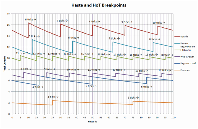
Here’s a look at the way haste affects the total duration and numbers of ticks of various HoTs:

Note that the numbers of ticks for Rejuvenation and Renew do not include the instant heal from Gift of the Earthmother and Divine Touch respectively, since these aren’t true ticks.

What you can see in this graph is the duration of the HoT decreasing as your haste increases (not quite linearly, haste does have a bit of a curve on it because of the way it’s calculated) and then when you reach the breakpoint the extra tick is added and the duration jumps up again, to somewhere above the nominal duration.
I’ve labelled the breakpoints to indicate the total number of ticks you’ll be getting from that breakpoint onwards as you increase your haste. So looking at the line for Riptide at the top, after the first breakpoint you’ll now be getting 6 ticks instead of the standard 5.

This graph also lets you see graphically the locations of the breakpoints for the HoTs, so if the table above wasn’t clear enough, you can use the graph instead. You can see on this graph, for example, the breakpoints for Renew and Rejuvenation at total haste percentages of 12.5%, 37.5% and 62.5%.

From a healing-per-mana (HPM) and healing-per-cast-time (HPCT) point of view, you want as many ticks as possible, because each extra tick adds a chunk of healing for no extra cost in time or mana. This makes it highly desireable to get above a breakpoint. However, HPM and HPCT only change at a breakpoint.

Healing per second (HPS)

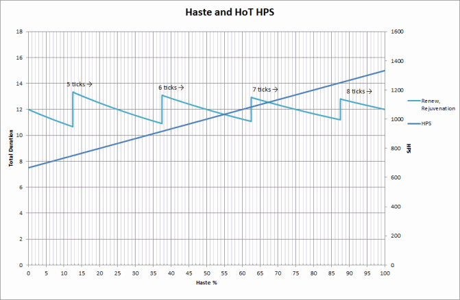
I also wanted to look at things from an different angle: healing per second. In this case, since the result is similar for every HoT, I’ve just picked out Renew/Rejuvenation as an example. (I’ve arbitrarily given each tick a value of 2k, which is about right for Renew on the beta. Look at the shape, rather than the numbers.)

The thing to notice here is that the HPS curve increases linearly while your haste increases, it doesn’t change around breakpoints. So if you’re using your HoTs for their throughput, you’re not going to see a radical difference in HPS from stepping over a “breakpoint”.

Of course, you will notice the difference between a HoT with a 10.7s duration and one with a 13.2s duration (the biggest jump in duration for Renew/Rejuvenation) when you have to spend GCDs more often to refresh your HoT, and of course refreshing a HoT less often saves mana, so you will still want to get over that breakpoint.


Updated 3rd October: Improved clarity and readability. Added more HoTs and more detail to the main graph. Included all the breakpoints in tabular form as well, for reference.

Possibly Related Posts:

[Cataclysm Beta] Priest Spells and Numbers

Posted by Malevica on September - 23 - 2010

With Cataclysm’s release creeping closer, I’ve started rebuilding my personal spreadsheet for my Priest, so I can better understand the spells and talents I’m using. It’s not as advanced as some of the insanely complicated ones you can find out there on the net, but I like having it to tell me:

Since I’ve spent the time generating these numbers, I figured I might as well put them up for information purposes. I’ll be doing a bit more conclusion-drawing in a later post, once I’ve had more of a chance to put this stuff into practice.

In the following, all values relate to beta build 12984, and were taken over the last 2-3days on Malevica who at level 85 had approximately 5k SP, 10% crit, 500 haste rating and 750 mastery rating, and a Disc spec with 2% Haste from Darkness (the trees have changed, so the link broke). When Cataclysm goes live you’ll probably have slightly better gear, but the general conclusions will all hold.

A final reminder that this is beta and all numbers are subject to change.

Stat Conversions

The first thing that’s needed is the set of conversion factors that let you convert ratings into percentages or points (in the case of Mastery):

Crit rating per %: 179.3134458. Haste rating per %: 128.1138737 Mastery rating per point: 179.1809524

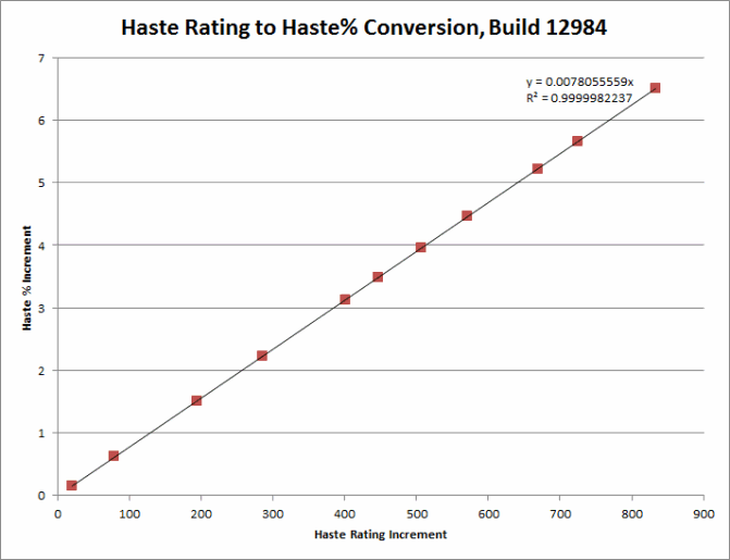
I generated these by standing around unbuffed and untalented and slowly removing gear to generate a series of data points, and then using a linear regression to extract the conversion factor.

By way of example, here’s a graph of the results for Haste:

Haste Rating to Haste % Conversion Chart

Because of the way I chose to plot this graph, the gradient (0.0078055559) of the graph is the haste% per point of haste rating, so the haste rating required for 1% haste is 1/ that value: 1/0.0078055559 = 128.1138733501.

Spell mana costs, cast times and coefficients

Now for some information about the spells themselves.

Mana costs are typically expressed within the game as a percentage of base mana, which is your mana pool with no gear or buffs on. (This is what lets the spell costs scale smoothly with your level.)

For a level 85 Priest, base mana = 20590

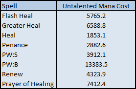
Using this number, I could work out the baseline (untalented and unglyphed) spell costs, and I also verified them in-game. Here are the current numbers (Blizzard does some funky things with rounding and tooltips so I’ve left the first decimal place for calculation purposes):

Flash Heal: 5765.2; Greater Heal: 6588.8; Heal: 1853.1; Penance: 2882.6; PW:S: 3912.1; PW:B: 13383.5; Renew: 4323.9; Prayer of Healing:	7412.4

Spell coefficients are trickier to get at, and have to be worked out empirically.

When calculating how much a spell should hit for, you take the base heal amount, and add your spellpower modified by another number which can be changed to affect how spells scale with spellpower.
The basic formula is:

Heal amount = Base heal amount + (Coefficient x Spellpower)

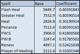
Here are the base heal amounts and coefficients I calculated:

Flash Heal: 5649.7, 0.60391843; Greater Heal: 7532.9, 0.80590514; Heal: 2824.8, 0.30190914; Penance:	7513.4, 0.80393165; PW:S: 3906.0, 0.41800560; PW:B: 3247.4, 0.91785502; Renew: 4897.1, 0.52421638; Prayer of Healing: 3112.4, 0.33301546

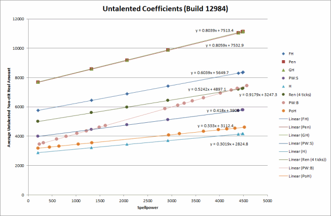
These were obtained by standing untalented and unbuffed (except PW:B, for obvious reasons) and recording the average heal amounts at varying spellpower levels. Like with the combat ratings, a linear regression was used to extract the base heal value (the intercept of the graph where SP=0) and coefficient (the gradient of the graph).

Here’s the values in graph format, for those interested:

The scaling on PW:B is a bit odd, since it scales very well with spellpower. That might change as the beta goes along, but remember that having such a long cooldown on a spell allows it to be a bit more highly-powered because it can’t end up dominating at high gear levels.

Typical hits and crits

Armed with the information above, I was able to work out what a typical heal should land for. In doing this, I have also included the ability to take into account the various talents available and their effects on the spells.

To work out the average hit, I used the following general formula:

Heal amount = [Base heal amount + (Coefficient x Spellpower)] x [1 + (% effect from talent A / 100)] x [1 + (% effect from talent B / 100)] x …

Those “6% increase” type talents are multiplicative, rather than additive, so if you get 6% from Twin Disciplines and 15% from Empowered Healing, you get at 22% increase, not the 21% you might expect (1.06 * 1.15 = 1.219).
At this time I want to say a huge thank you to Blizzard for trimming some of those passive healing increase type talents, it made my life a lot easier!

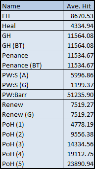
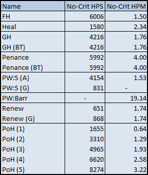
Anyway, for information purposes, here are the numbers untalented:

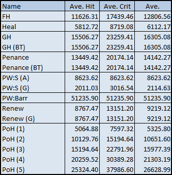
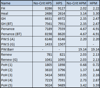
And in a typical Disc spec:

In these and the other tables (BT) means the spell is being cast while Borrowed Time is up, (G) refers to either a glyphed version of a spell (Renew) or the glyph component of a spell (PW:S). The numbers in brackets after PoH are the number of targets the spell hits.

What I’ve included in the second table is a column of typical crits (heal x 1.5) and then a weighted average illustrating what all of your casts, a mix of hits and crits, would average out to over time.

These tables are really useful for helping with spell selection. If you have an idea of how much each spell heals for, you’re able to pick the right size for the job, and understand where they fit into the healing toolkit.

Healing per second and healing per mana

As well as raw healing amounts, healers also need to know how quickly they can crank out healing with a spell, and how mana-efficient those spells are, especially in Cataclysm.

Here are the values untalented, assuming no crits:

And once again, in a typical Disc spec:

Once again, I’ve added extra columns to the second table. The HPS and HPM columns are based on that weighted average I talked about in the previous section, and should give a better estimate of the HPS and HPM you might achieve if you consider a whole fight.

I’ve not included HPS for PW:B because it’s not a repeatable cast, and I’ve not included HPM for the Glyph of PW:S because it’s essentially cost-free.

Possibly Related Posts:

[Cataclysm Beta] Levelling in Cataclysm

Posted by Malevica on September - 17 - 2010

I wanted to post about this a while ago, but with testing as much of the game as possible (which is the point of the beta, after all) I’m still not quite 85 yet, but I have now done most of the levelling content.

I’ve levelled exclusively as Discipline, to see if it’s possible, and because I didn’t fancy resetting a Shadow and healing spec every time a new build gets pushed out.

How long will it take to get to 85?

The big question everyone will ask. Here’s my response.

First, a caveat: all I can offer here is an estimate. Everyone will level at a different pace depending on how focused you are, how efficient you are, how quickly you kill mobs, how much competition there is for spawns, and so on. Plus, numbers are the one thing that you cannot count on in a beta, so this all might change.
And remember I’m levelling as a non-DPS spec in partially unfinished zones without level-appropriate gear, so take all that into account too.

Just don’t complain if I’m miles out, that’s all I’m saying!

On the beta I levelled from 80-82 over two evenings, so it took maybe 4-5 hours per level. Level 82-83 was a lot slower because the XP per level jumped from around 1.7 million to around 6 million (if I’m remembering those numbers correctly), so it took me about 3 evenings to reach 83. Levels 83-84 and 84-85 require relatively similar amounts of XP as 82-83, and thus roughly the same time, although it’s taken me longer because of incomplete zones and other things being introduced into the game that I’ve been testing instead.

Overall, I’d estimate that level 85 will be within reach within about 40-50 hours of /played, which means roughly 2 weeks of real time, and you could shorten that quite a lot if you played more on the weekends, played a more suitable “levelling” spec or ignored professions, for example.

Levelling as a healing spec

Impressions
I’ve got Malevica to 84½ as Discipline and I’ve not had any problems at all until Twilight Highlands, which is because on the beta these zones aren’t itemised, so I’m behind the curve in gear; I’m still wearing quite a bit of my T10 gear. This won’t be a problem when Cataclysm goes live.
You do still need to pay attention to your HP and weave healing spells in though, which is no bad thing.

Choice of spec
I spent most of my time as a standard Disc healing spec, but I switched to a specific levelling spec as the content got harder and I haven’t been running many instances since queues are pretty horrific even as a healer.

For the levelling spec I picked up Reflective Shield, Focused Will and Atonement, as well as Evangelism and Archangel.

It looks something like this at 85. You can take your pick about which of the extra talents in Holy or Shadow to take first. I personally pushed points into Holy to speed up my Smites before putting points into Shadow, and left the Shadowfiend points for last as my mana regen started to tank at higher levels. I didn’t theorycraft the decision much though, just went with what felt right.

The foundation of levelling as Discipline is Evangelism, since every Smite you cast grants you a 4% increase to the damage of your Smite, Holy Fire and Penance (and reduces the cost by 6% per stack) so getting it stacked to 5 is vital. Holy Fire is also still powerful, so keep that on cooldown as much as possible.

You get 15s from your last Smite before Evangelism fades, so you’ll need to pull again fairly quickly if you want to avoid having to restack it.
I’ve generally tended to keep Evangelism stacked from pull to pull rather than consuming it with Archangel. It means I have to drink from time to time if I’ve needed to heal myself as well, but you could always put those points into the Shadowfiend cooldown earlier.
If you’re not going to be able to refresh your stack in time, remember to hit Archangel so you don’t waste the mana.

The other thing to bear in mind is that Power Word: Shield will proc Borrowed Time for a 15% haste increase until you cast a spell with a cast time, which means it will lower the GCD on your DoTs. So once I’ve got Evangelism’s stack refreshed, I tend to cast Power Word: Shield on myself followed by Shadow Word: Pain and Devouring Plague and finishing up with a Penance.
From there, it’s a case of throwing out a Holy Fire and Smiting until the mob is dead.

You may or may not need to use your DoTs if the mobs die fast enough. In the gear I’m in the mobs are dying as the DoTs are fading, but if you’re killing faster you could just drop the DoTs from the rotation.

Extra tips

A few more things to remember:

  • For Atonement to work, you need to be within 8 yards of the mob you’re Smiting, in order to get healed. Just bear it in mind when attacking casters!
  • Glyph of Smite
  • is really good to switch in while levelling. I also have the Divine Accuracy glyph, which helps too.

What about Holy?
I tried levelling a little as Holy on my other Priest, although she’s not got very far yet. I do like the Chakra system so far though.

The way it currently works is that you cast Chakra on yourself and then Smite your opponent, which gives you a buff that grants you 15% increased Shadow and Holy damage for 30 seconds, refreshed every time you Smite. This lets you maintain a pretty much 100% uptime if you want to.

The cooldown on Chakra is currently 1 minute though, so you can’t change your Chakra state any more often than that.

The questing experience in general

The first thing is that the zones are big. You definitely won’t be short of questing locations.

Vashj’ir and Hyjal are at roughly the same level so you can pick either one to begin with (just like Borean Tundra and Howling Fjord in WotLK). I’d recommend doing the other zone afterwards as well, because they’re both pretty cool, but you might be able to skip straight to Deepholm instead. Uldum and Twilight Highlands are the 83-85 zones, and seem to be at roughly equal level (like Storm Peaks and Icecrown in WotLK), so you have another choice of destination here.

The quest progression within the new zones is a lot more linear than it was in most of WotLK was. It’s much more like the kind of progression you got in Icecrown with the phasing, only every zone is like that.

I love this because it makes for much better story-telling, but it does mean that there are occasional bottlenecks where low respawn rates or tricky quests can hold you up (which is again why we have a beta, so we can catch these things early).
Hyjal in particular is a great use of story-telling as you work your way through the zone helping out the Earthen Ring, and it’s combined with some great use of phasing to make you feel that you’re really making a difference as you quest through the zone.

Thumbs up from me!

Possibly Related Posts:

Categories: Cataclysm Beta

[Cataclysm Beta] Cataclysm Party UI Revisited

Posted by Malevica on September - 12 - 2010

Since the last time I posted about this, Blizzard has listened to the feedback and revisited the party/raid frames a little bit with more options that we were asking for.

The new options pane

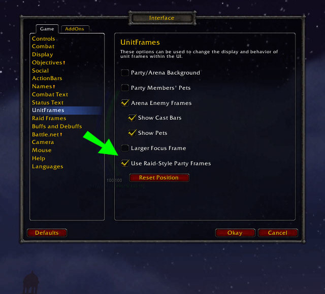
Backing up one step, in the current beta build (12942) the new-style frames appear to be off by default. You turn them on by ticking the “Use raid-style party frames” option in the Interface-Unitframes menu screen, as shown below:

Screenshot of the Options-Interface-Unitframes menu, with the "Use raid-style party frames" option ticked and indicated by a big green arrow

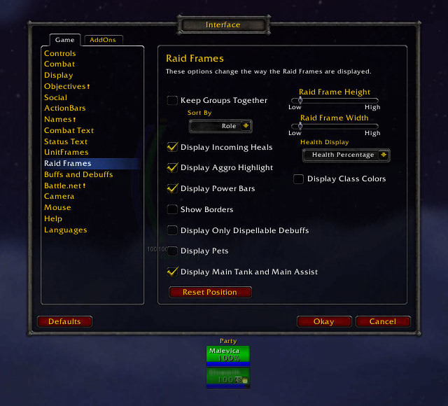
Customising the actual raidframes is in the Raid Frames menu, and now gives you the following options:

The Raid Frames configuration page, as of build 12942

I’ll step briefly through the new additions, working down the columns.

A toggle for power bars

I think all healers will probably want them on, and it’s a shame in a way that you can’t choose to show mana but not show rage/energy/runic power, but that’s a minor point.

Do you really need a screenshot for this?

Border

A slightly odd-looking grey border, which can be turned on or off. I imagine most people will want it off, but it’s on by default. It shows around the raidframe box, as well as putting lines around the individual frames and power bars, as you can see below:

Screenshot of the raid frames with borders enabled

Resizeable frames

This was high up most people’s wishlists, and I’m glad to see it make it in.

You can scale width and height independently, and the range of sizes goes from low to high, with very fine control in between (the slider has around 35 steps, so plenty of adjustability there). Here’s the two extremes for your viewing pleasure:

Low (default): Raid Frames, scaled as small as they will go

High: Raid Frames, scaled as large as they will go

Now there’s some interesting scaling things here. The name text, power bars and debuff indicator (upper-right) don’t change scale, although the health remaining text and debuff icons (lower-left) do. I’m going to assume this is a result of this being beta and not yet finished, but it does look a bit odd.

Numerical health display

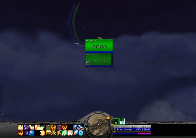
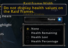
You now have options for the numerical health display, although it’s turned off by defauly. It’s got options for absolute health remaining (long-form, i.e. 49516 rather than 49.5k), health lost (same format) or health percentage. A short-form option would be the icing on the cake, but definitely a leap forward.
Here’s the selection dropdown:
Health Display options for the new raid frames

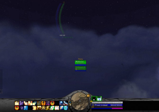
And some examples:

  • Health Remaining: Screenshot of Raid Frames with health remaining displayed
  • Health Lost: Screenshot of the Raid Frames with Health Lost displayed
  • Health Percentage: Screenshot of Raid Frames with Health Percentage shown

Class-coloured health bars

By default this is set to off, but you can turn it on if you want to. Another one I’m very pleased to see make it in.

Possibly Related Posts:

Categories: Cataclysm Beta

[Cataclysm Beta] The new party UI

Posted by Malevica on August - 11 - 2010

Since this was first posted, the party UI and options have been developed further. Please check out my update post for the differences.


I’ve managed to heal a fairly dismal 2 instances, and we never finished the Stonecore. Still, I’ve had a good play with the new party healing UI, so it’s time to share some thoughts.

If you’re interested in other takes, Matticus (twice!) and Derevka have also posted about this, amongst others.

Although this is currently just being used for the party interface. I’m assuming this will be extended and used as a replacement for the default raid frames as well, so some of my thoughts and comments may also have raiding in mind.

What does it look like?

This:

Busy party UI screenshot

Or, when things are a bit calmer, this:

Quieter party UI screenshot

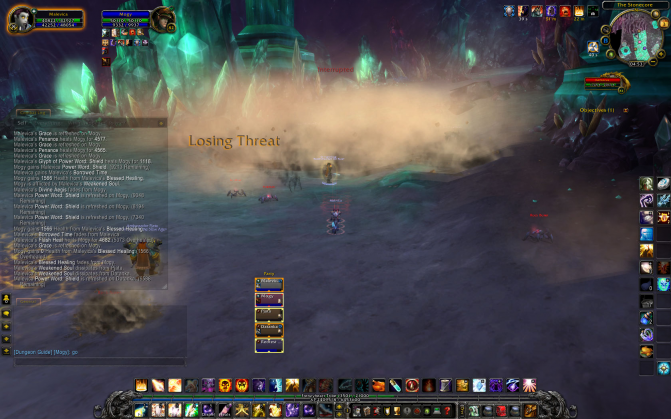
And in full context (1680 x 1050), it looks like this:

Party UI set within a whole screen

For the record, I wouldn't normally raid with the combatlog taking up half my screen, but it's really handy for seeing what the hell's going on in content I don't know well yet.

It looks something like a hybrid of VuhDo with Grid. It’s fairly compact and clean-looking without sacrificing too much functionality for compactness. It also fits well with the rest of the UI in general, which is a big plus.

Personally I don’t tend to get too wrapped up in aesthetics, and this is nothing really revolutionary, so I’ll skip on quickly.

Information display

How does the healing UI do straight out of the box? Actually, pretty well, with some caveats.

Class-coloured bars

The first thing I noticed when I looked at the UI in a freshly-formed group was that the bars are class-coloured Grid-style. I understand that UI design is a hugely subjective area, but I’ve never managed to see the appeal of class-coloured bars.
I don’t feel that class-coloured bars actually give me any information I need. Rarely do I think about what class someone is before healing them and the only situations I can think of where I’d need to know are when people are dead, and their bars are a uniform grey (I might choose to combat res a Druid, or not to combat res a Shaman, for example).

The argument for bars which change from green through orange/yellow to red as HP falls is that it draws your attention quickly to those in need of a heal and gives some indication of their state, in a more noticeable way than just shrinking the health bar. When you’re scanning 25 bars, a big bold colour change jumps out at you. So having class-coloured bars feels like a missed opportunity to give me information.

A more nitpicky point is that the standard DK colour could do with being made a bit bolder. It’s quite tricky to spot the health deficit on Sielydine’s bar, at least for me in my computer room in daylight.

Another screenshot, this time the dark red of the DK's health bar and the black background are tricky to distinguish

Role icons

In the upper left corner of each bar is an icon representing the role of each player as assigned by the Dungeon Finder. It’s a nice feature to have, for sure.

Ideally I’d probably prefer to be able to hide this information, since it tends to be something you look at once and never again and it’s currently taking up space, but given that the purpose of these frames is to Just Work™, hiding the icons behind a hotkey or right-click probably isn’t an option.

Target and Aggro indicators

The screenshot just above is a good example of this. The player you currently have targeted, in this case Muhmann, gets a cream-coloured border around them. Players with aggro get the expected red border, with arrow embellishments for good measure. These are standard features for raid frames these days. The target indicator seems to have higher priority than the aggro indicator, but the red arrow marks still show through since the target indicator doesn’t include them.

I’m a little confused about the other frame colours though. Let’s have another look at the first screenshot I posted (reproduced below, to save your scrollwheels):

Busy party UI screenshot

Mogy is the tank this time; he’s got the cream border because I’m targeting him, and he has aggro because you can see the red triangles. All fine and dandy.

It’s not made clear what the yellow and ochre borders around the others represent. My guess is that they’re part of the aggro indicator, corresponding to people with moderate and high threat. I’m basing this mostly on the fact that they’re a similar shape to the red aggro indicator.

Incoming Heals

Another screenshot, this time the dark red of the DK's health bar and the black background are tricky to distinguish

Another nifty feature you can see exemplified in the screenshot above is the display of incoming heals on the bar. There’s not a huge amount to say about this really, incoming heals show up as a big bright green chunk on the end of the bar, overheals spill out beyond the bar (which is good, it lets you see just how much of an overheal you’re casting) and the size of the bar appears to be more-or-less accurate, although I’ve not been able to fully test it with Mortal Strikes etc yet.

For this to be really useful in a raid situation it needs to be able to show other people’s heals as well as your own, so if Blizzard do make this the template for new raid frames I hope they’ve built that functionality in, but for a party just showing yours is plenty.

HoTs and Debuffs

For discussion purposes, here’s that screenshot, repeated once again:

Busy party UI screenshot

Working from the top, the blue circle in the top-right corner of my frame shows at a glance that I have a magical debuff. If you want to find out at a glance what debuff it is, that’s in the lower-left corner where all the debuffs are displayed together as standard icons, growing left to right. Both the small indicator and large icon will display tooltips on mouseover.

Moving down, Mogy has both PW:S and Weakened Soul, while below him Pjata only has PW:S. HoTs appear all together in the lower-right corner, growing from right to left.

Datanka is very kindly illustrating what a debuff with multiple stacks looks like. The number is nice and clear and readable, although it does obscure most of the icon. With space being at a premium though, some sacrifices are inevitable, and in this case I’d rather see stacks (which are hard to work out) than the icon (which you can figure out from context).

What you don’t get is any way to see the duration remaining as a number, only as the grey overlay. There’s just no way to fit that onto the icons sensibly, but I do prefer to see a number, since I often find the grey overlay thing a bit too tricky to discern.

I didn’t manage to catch a screenshot of this, but diseases work in the same way as magic debuffs do, with a small orange icon in the top-right and a “proper” icon in the lower-left. The last image on Matt’s first post shows this though.

I’m sort of torn on the dual debuff indicators. I imagine the top-right corner indicators are intended to highlight that someone has a debuff, to draw attention more quickly and help you select your cleanse spell of choice while you look at the icon and decide how you want to respond.
I’m all in favour of simple tricks to grab attention (see the discussion above about bar colours) but I’m not sure a relatively tiny icon is the best way to do it. I’d be happier seeing larger debuff icons (with thicker coloured borders) instead and the indicator space used for something else. I can’t help feeling like it’s awkward having related information in opposite corners.

Overall though the debuffs icons are pretty clear, stacks are obvious, the debuff type is readily apparent and they’re arranged logically in corners, so for a default, no-configuration UI this is actually really good.

The main missing feature that will be familiar to many of us is the ability to set up custom debuffs for special attention (Harvest Soul, Frost Blast, Penetrating Cold, amongst others). I’d love to see it, but I think that level of customisation is probably beyond the scope of what Blizzard is trying to achieve here, and possibly beyond what they’d be comfortable with including in the default UI.
Especially since different players care about different debuffs (for example, I don’t highlight Chilled to the Bone, while a melee DPS might want that displayed prominently).

Configuration

The thing to remember about this UI is that it needs to Just Work™ without needing to be configured or customised, and it needs to work for all classes, not just healers.

As a result, there’s not much customisation. Your layout choices are limited to showing pets, main tanks and main assists and keeping groups together (as opposed to sorting by name or role). You can also opt to turn off incoming heals, aggro highlights and to filter only buffs you can dispel.

Wishlist

If you’re used to healing with VuhDo, Grid, Healbot, Pitbull, Xperl or another set of full-featured, customisable raidframes you’ll probably find this quite limiting. This is not going to replace those addons, but it’s a pretty good compromise solution which shouldn’t impair your performance too much if you have to resort to using it (except the whole no click-healing thing…).

As Matt commented, “It’s important to discern between must have and nice to have but can probably heal without it type changes.” The danger is that if you add too much configurability, or too much information, you destroy the simplicity which is the whole point.

With that in mind, here’s my wishlist for must have items. These are things which I found actively obstructing my ability to heal effectively.

  • Let us choose between class-coloured and HP-coloured health bars. I thought about including this on the nice-to-have section, but actually this was causing me to neglect people or incorrectly estimate people’s status
  • Instead or as well as the previous point, brighten up the bar colours a bit, since some of the darker shades (DK in particular)can be tricky to tell from the background
  • Provide numerical timers, at least for HoTs. Make the icons bigger if need be

And the nice-to-have items:

  • Resizable bars. These are a decent compromise, but I did find them a little small at times. I tend to err on the side of larger boxes because poor eyesight combined with a high resolution screen is a bad combination
  • I personally tend to find it creates information overload, but numerical health deficits for players are fairly common to see in healing interfaces, especially when overhealing matters
  • Click-healing. The ability to bind spells to mouse buttons and modifiers. Not as the only way but many people find it a very intuitive way of healing. Unconfigured, a left-click could just be bound to targeting as normal, which wouldn’t interfere with people who didn’t want to click-heal. If you wanted to use a menu on someone, you could bind “menu” to something, or target them the old-fashioned way

On the whole the new party frames are a big step forward, and actually more-or-less a complete solution. They’re not perfect for me, but ‘perfect’ is a very subjective concept and the default UI is, after all, an exercise in compromise.

Possibly Related Posts:

Categories: Cataclysm Beta, Opinion