Since the last time I posted about this, Blizzard has listened to the feedback and revisited the party/raid frames a little bit with more options that we were asking for.
The new options pane
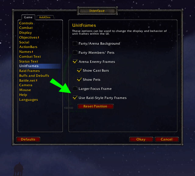
Backing up one step, in the current beta build (12942) the new-style frames appear to be off by default. You turn them on by ticking the “Use raid-style party frames” option in the Interface-Unitframes menu screen, as shown below:
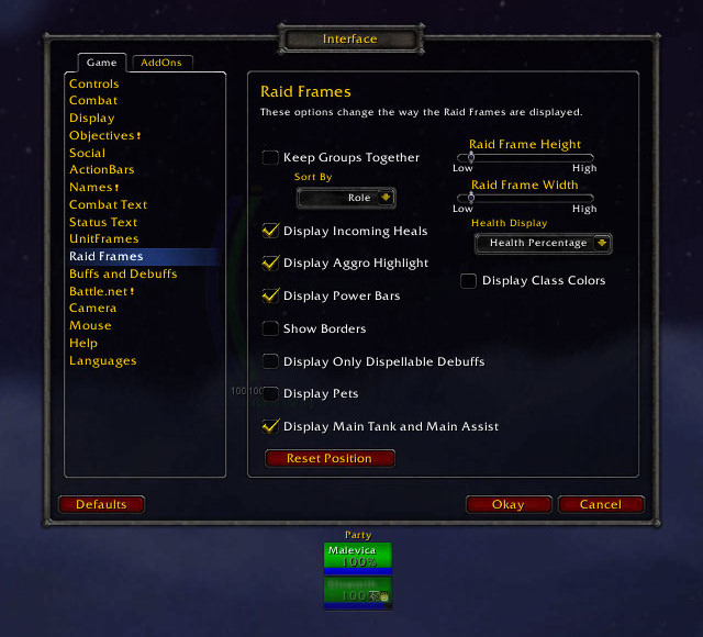
Customising the actual raidframes is in the Raid Frames menu, and now gives you the following options:
I’ll step briefly through the new additions, working down the columns.
A toggle for power bars
I think all healers will probably want them on, and it’s a shame in a way that you can’t choose to show mana but not show rage/energy/runic power, but that’s a minor point.
Do you really need a screenshot for this?
Border
A slightly odd-looking grey border, which can be turned on or off. I imagine most people will want it off, but it’s on by default. It shows around the raidframe box, as well as putting lines around the individual frames and power bars, as you can see below:
Resizeable frames
This was high up most people’s wishlists, and I’m glad to see it make it in.
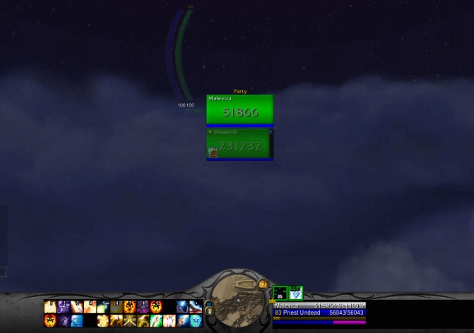
You can scale width and height independently, and the range of sizes goes from low to high, with very fine control in between (the slider has around 35 steps, so plenty of adjustability there). Here’s the two extremes for your viewing pleasure:
Low (default): 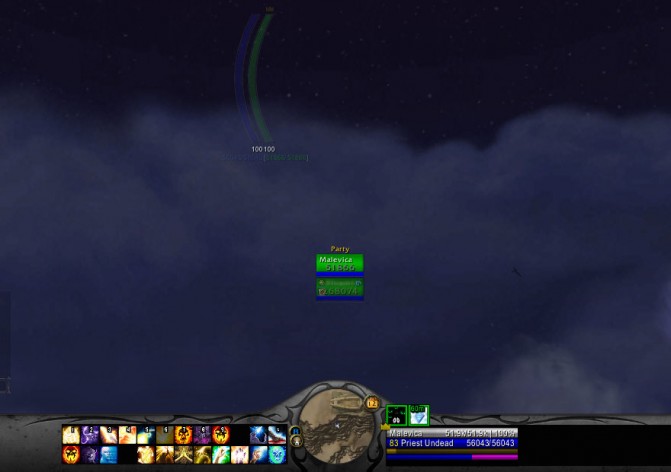
Now there’s some interesting scaling things here. The name text, power bars and debuff indicator (upper-right) don’t change scale, although the health remaining text and debuff icons (lower-left) do. I’m going to assume this is a result of this being beta and not yet finished, but it does look a bit odd.
Numerical health display
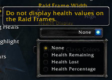
You now have options for the numerical health display, although it’s turned off by defauly. It’s got options for absolute health remaining (long-form, i.e. 49516 rather than 49.5k), health lost (same format) or health percentage. A short-form option would be the icing on the cake, but definitely a leap forward.
Here’s the selection dropdown:
And some examples:
Class-coloured health bars
By default this is set to off, but you can turn it on if you want to. Another one I’m very pleased to see make it in.


